A game jam isn't the time to learn new workflows or pick up new skills, right? Especially when working against a deadline, you have to write what you know... but you also have to photograph what you know, collage what you know, embroider what you know... you know?
In fact, both of us tried many new things through the production of Ten Metre Tide. Learning Ren'Py, learning to 'speak the language' of visual novels, and of course, the integrative approach to our constituent art forms and working as a creative duo: that was all new to us. After putting it all together, we've broken it down again. Here are some mostly technical notes on the production of our game.
Photography
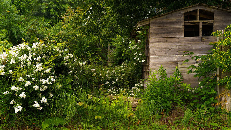
Photography took place on the first full weekend of the jam. Early on a hazy Saturday morning, we took the Casco Bay Lines ferry out to Peaks Island, an exclave of our home city of Portland. The ride took about twenty minutes and included a good view of Portland's peninsula, Bug Light and Spring Point Ledge in South Portland, plus a fly-by of Fort Gorges, one of the key visuals in the VN.
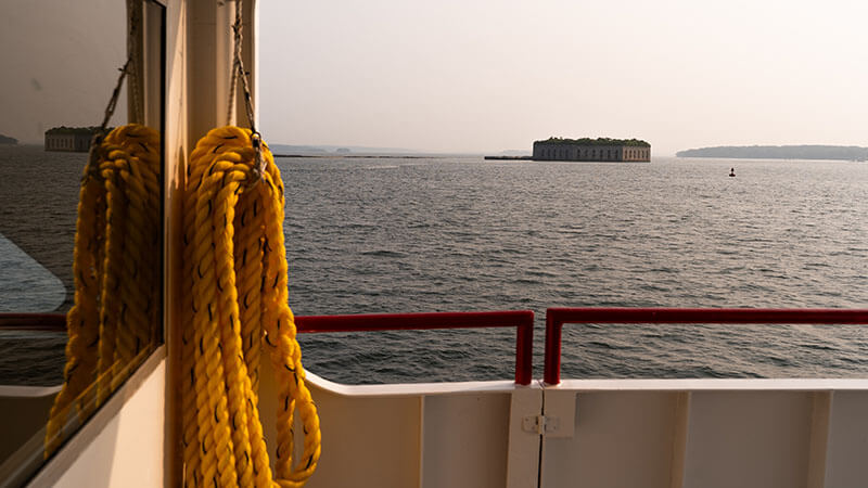
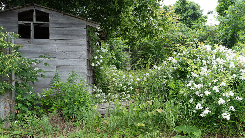
Peaks is the major inspiration for the look and design of Fort Colwyn. It's certainly more lush and vibrant than how FC is described, but it's as close as one could imagine FC in the real world. It has a year-round population of just under a thousand, which swells with tourists and seasonal residents in the summer. Commercial activity is more or less limited to a single street near the ferry terminal on the western shore. Residential roads branch out from there, and the landscape becomes progressively woodsier as one moves east.
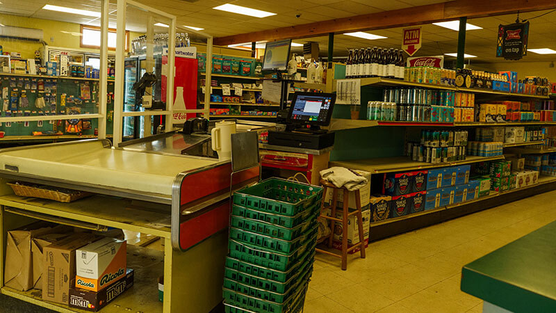
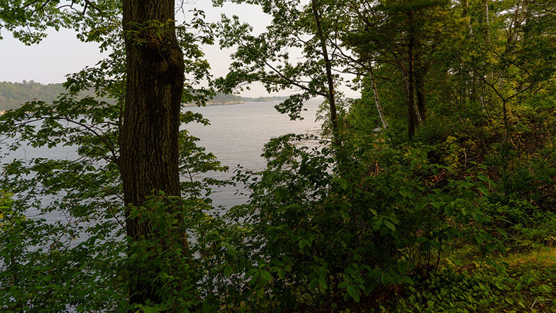
At this point in the development process, we were already settling down on the visual style and even had a partial shot list to work from. Hannigan's Island Market would stand in for Erica's store, the ferry terminal could be FC's breakwater, and there were plenty of natural scenes to shoot in their full splendor – the glorious start of summer in Maine! As we walked around the quiet island, taking photos and chatting about our still-green story, it was easy to forget that this place is technically a part of our own city.
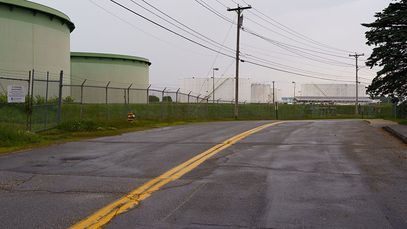
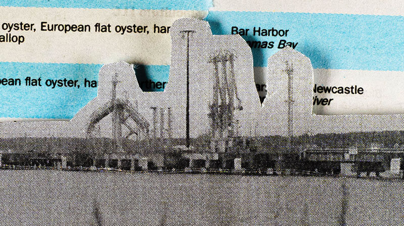
A second day of shooting took place the following weekend in South Portland. Several large banks of gas tanks owned by Sunoco, Irving, and Sprauge sit on the waterfront, serviced by trucks, rail, and ships. The tanks themselves and the various pipes and docks served as our Maitlandside backgrounds.
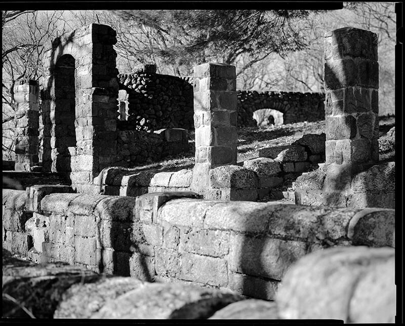
A small handful of photos were pulled from my back catalog: off the top of my head, the cemetery background is an image of Schoolmaster Hill in Boston, and the final scene of Jinny's door is an industrial freezer in Sackville, New Brunswick.
As a primarily black-and-white film photographer, and as one who shoots mostly in 4:5 or in squares, shooting for widescreen and in both color and monochrome was an interesting challenge. I'm mostly happy with how the images turned out, but there were a few that we had to mirror or creatively crop in order to work with the GUI and character sprites.
Backgrounds
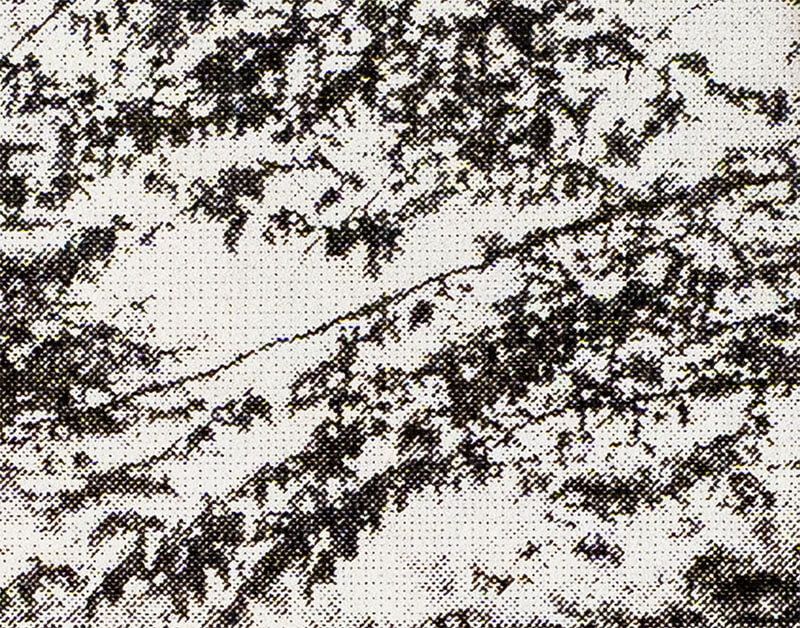
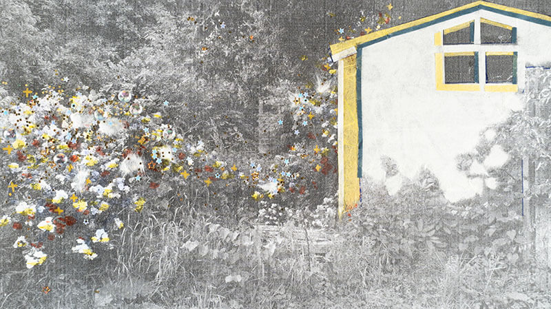
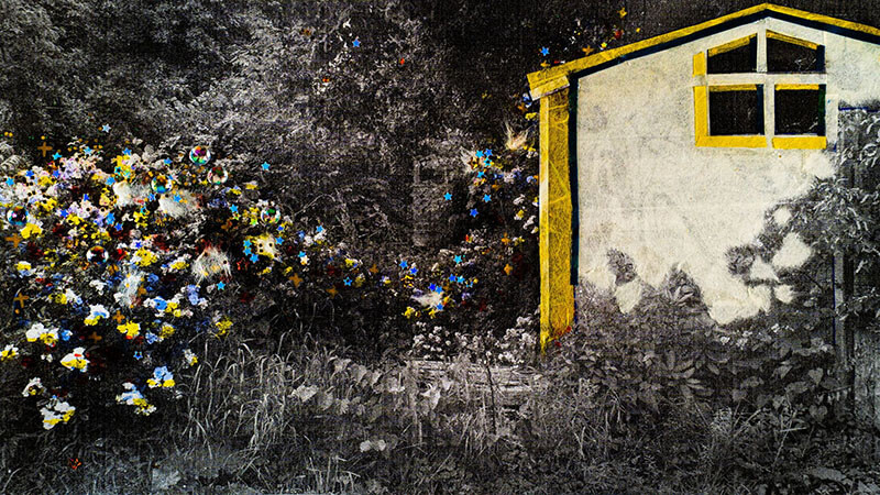
The first step in this process was to edit the (color) images in Lightroom. Next was to print. We printed on an office laserjet, which embedded its own unique look onto the images. I knew from the start that there would be a loss in fine detail and tonality, but the cross-hatching effect was more pronounced than I expected. That's fine; that's cool. But there was also severe banding across every image, probably due to some issue with the print drum. Cleaning the drum improved the issue, but didn't solve it. We ultimately decided to move ahead despite the banding, and I'm glad we did.
Notes from Pilot on making backgrounds:
Sitting in our closet is a tote bag of collage materials that I've been accumulating for half a decade: stickers, paper, stationery, and miscellaneous. To make the backgrounds, I used:
- An entire bottle of clear glue
- About four different magazines, mostly ones about Maine
- Three children's sticker books (farm animals, colours, and Animal Crossing)
- Mulberry paper that Kai had gifted me a few birthdays ago
- Many types of decorative washi tape, using some of the rolls down to the cardboard
- Highlighters, sparkle pens, paint markers, and two very abused gel pens
- Glitter glue (I'm still finding stray star glitters at my desk)
- Embroidery thread
- Countless miscellaneous stickers from various sheets and sources
...And probably some other sorts of recyclable trash. There was plenty of ripping, tearing, cutting, and pasting involved, and throughout it all I was lost in the sauce (glue).
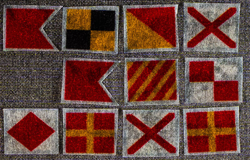
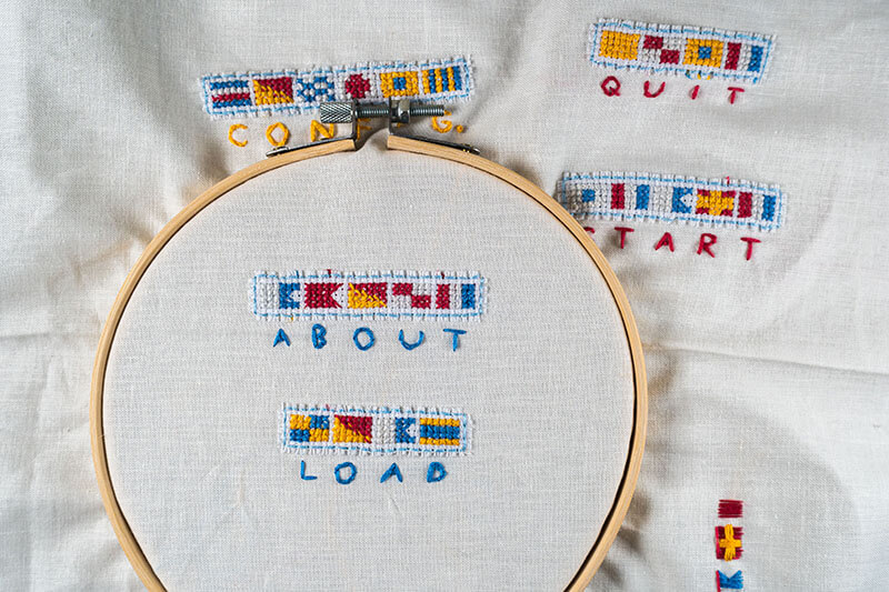
The washi tape roll that saw the most use was one of the ICS flag alphabet, endlessly repeating. Each time they're seen, I can promise you they have some vague meaning, even if not a meaningful one. Because it's one of my favourite stationery items, I tried to waste as little as possible. This resulted in some weird translations. For example, New Hampshire was abbreviated to HM and Nova Scotia to VS because N flags were too hot of a commodity, and I really didn't want to waste 25 letters to get one more N.
Maybe by the next project I'll be brave and attempt to draw backgrounds, relearn perspective, push myself and stuff… Or maybe not. A short jam wasn't the time to get frustrated at an undeveloped skill, so I stuck to what I felt comfortable with and actively enjoyed doing.
Embroidery
Pilot's notes again:
From the very, very beginning of our brainstorming I knew I wanted to embroider some part of the game. Embroidered collage of fabric, beads, and found materials is my favourite kind of art to make. I picked up 6 skeins of embroidery floss (red, blue, yellow, super pale blue, slightly pale blue, and a very dark gray blue; I'm allergic to using pure #ffffff and #000000 for anything), some cotton fat quarters, and my big box of beads, fabric scraps, ribbons, and whatever else I can feasibly sew onto an embroidery hoop.
I'm really happy I got to make the hoop for our title card. I feel the most in my element making fabric collages like that, and had been itching to make one anyways. It was fun combining organized cross-stitching and messy surface stitching, and I felt the two needleworks balance each other out.
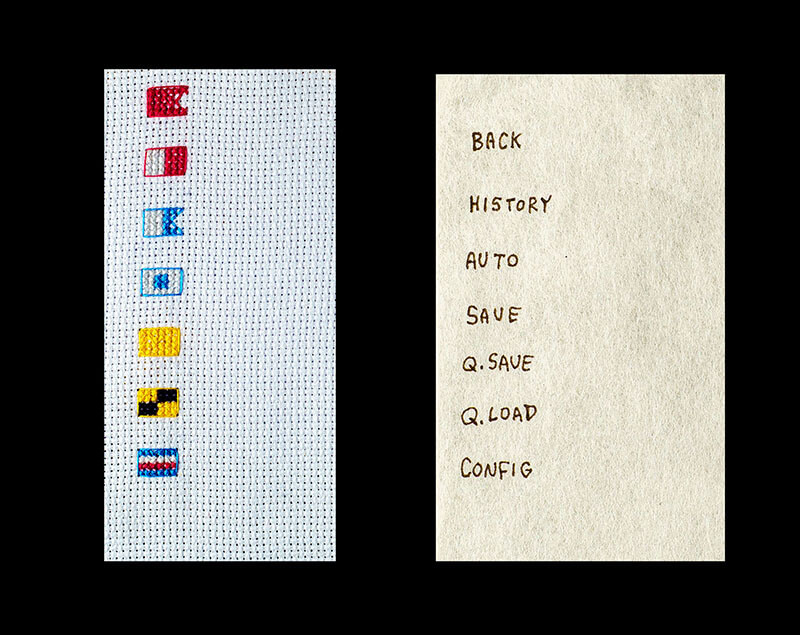
All of the UI buttons were cross-stitched onto scrap aida cloth, with handwritten mulberry labels layered on top. I made buttons that fully spelled out their functions in ICS flags that were intended for the loading screen, but ultimately those got scrapped and instead are only seen in the big ephemera layouts.
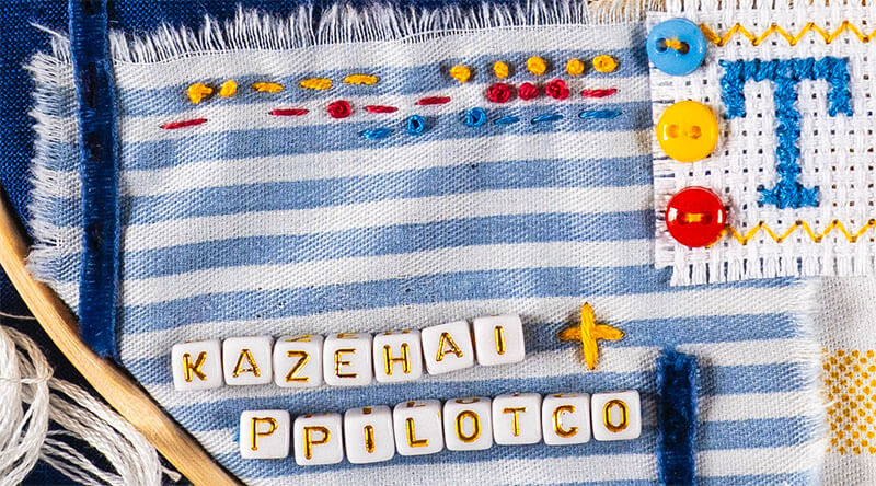
The dialogue box and NVL mode box are similar, just featuring fewer flags and a lot more Morse code. Both boxes have very subtle Morse around the edges: something along the lines of TOXICYURIVNJAM 2025 KAZEHAIPPILOTCO TENMETRETIDE. It's not meant to be read, and it's just something I do in all embroidered artwork I make. The idea that there's an illegible watermark in every single scene is just kind of funny, too.
Re-digitization
With the images collaged, embroidered, stickered, decorated, and illustrated, and with the GUI embroidered, it was time to re-digitize. The initial plan was to scan everything back in with a flatbed. This would ensure even illumination and maintain flatness, which is necessary for edge-to-edge sharpness. However, the backgrounds were thick with glue, tape, embroidery thread, and plastic gemstones. The embroidery probably needed to stay on hoops, and it included beads and tall knots. Putting all that stuff on the scanner glass wasn't an option, so we changed course and digitized on the copy stand instead.
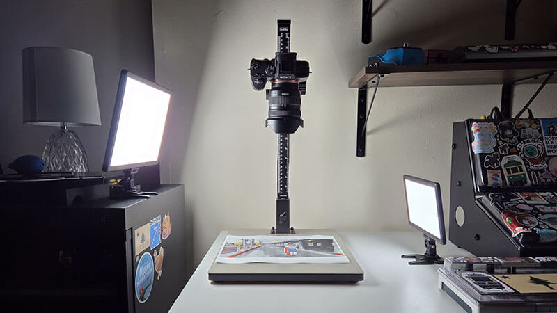
A copy stand is nothing more than a flat platform where a document or item can sit evenly illuminated, while an attached arm holds a camera above and parallel. Simple in many ways, but the simplicity invites complication. Maintaining even illumination becomes a problem as you use external lights, and same with color temperature across the scene. Light pollution from the home, from LED status indicators, and from variation between key lights becomes a thorn in the side. Even though I was using high-CRI video lights, the white balance shifts noticeably from edge to edge on many of our images.
Flatness is another issue. On a flatbed scanner, a lid would press the whole thing flat against the scanner glass. But with the images free to hold their natural shapes, edges would lift or parts of the page would be warped due to drying glue, moisture in the air, or wrinkles in the paper.
Without flatness, there's a loss in sharpness. Depth of field becomes razor thin when shooting subjects close to the camera's image-forming plane. When one side of the sheet is closer to the camera than the other, one side will be sharper and the other will be softer: there's only so much that can be solved by increasing the aperture or sharpening in post. Focus stacking is a remedy, but a time-intensive one that I didn't want to deal with on a game jam deadline.
With all those caveats understood, the final decision was lighting. As mentioned above, I opted to shoot at night with video lights rather than use natural light. Standard procedure for lighting 2D items (documents or photographs, generally) on a copy stand is to use at least two light sources set at ~45 degrees to the subject. This reduces hotspots and minimizes the opportunity for the item to cast shadows on itself. So, I tried that first.
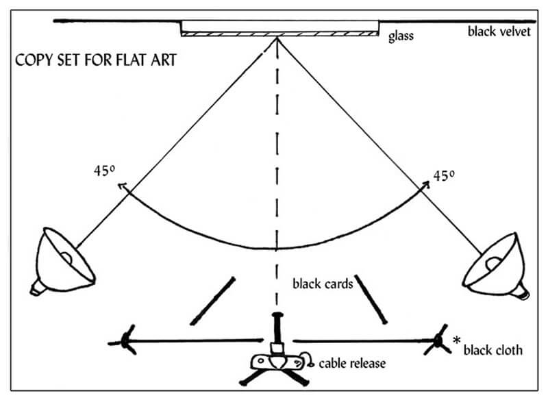
An issue quickly came to the fore: the backgrounds, and especially the embroidery, are more 3D than 2D. In retrospect, this should have been obvious, but I didn't really understand until I was looking at the images, wondering “Why does this look so dull?” The aida cloth lost its texture, the layers of collage collapsed into a single plane. Boring. So, I took a cue from the portrait world. Rather than working my lights evenly, I'd use one light for fill, still set at ~45 degrees, and the other as a key light, set oblique to the subject.
This is the approach I took for the remainder of the project. The new lighting setup gave toothfulness to the aida cloth, emphasized depth in the threads and knots, and cast subtle, beautiful shadows between collaged layers, stickers, and base image of the backgrounds.
With the backgrounds re-digitized, the final step was another edit. I had moved forward despite a number of issues that bothered me a lot: the banding, the color shift, the loss in sharpness… and in the end, those artifacts of the digital-analog-digital process gave the pictures a unique character that I wouldn't ever trade away.
“Whatever you now find weird, ugly, uncomfortable and nasty about a new medium will surely become its signature. CD distortion, the jitteriness of digital video, the crap sound of 8-bit - all of these will be cherished and emulated as soon as they can be avoided. It's the sound of failure… the sound of things going out of control, of a medium pushing to its limits and breaking apart.” - Brian Eno
For legibility's sake, I put a 25% opacity layer over all the backgrounds: a necessary evil. They also had to be resized to 1920px on the long edge. We're working on a zine including the images in their full-resolution, full-color, vibrant glory. Pilot did something wonderful with my images and I am so pleased with how they all turned out, so I am hoping everyone can see these backgrounds the way we did before we put them in the game.
Music
From the beginning, I wanted this game's music to have a sparse, darkly nostalgic atmosphere. A secondary personal goal was to program the soundtrack entirely on hardware -- as someone who considers themself a performer-musician rather than a composer, it's so much easier for me to sketch ideas out on an instrument or physical sequencer… but life got in the way. I had to do some last-minute travel and couldn't bring my gear. By the time I got home, we were running up against the deadline and I had to work entirely in Ableton in the interest of time.
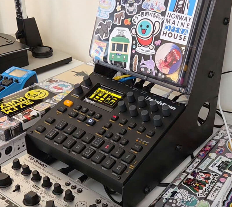
But I'm happy with my performance against the first goal! I took inspiration from Boards of Canada for the atmosphere, and especially Yume Nikki for the structure. I worked with short loops, doing some basic modulation over a few repetitions to keep things from getting too stale. Post-release, I wish I had done a little more to keep the loops fresh. Almost all sounds were programmed on two synths: Arturia's Pigments and the Elektron Digitone.
Pilot handled the sound effects, pulling from VN-dev classic sources Taira Komori and FilmCow as well as the U.S. National Parks Service. It was nice to have something off our plates for this project (notwithstanding Pilot's hard work in curation and implementation!), but next time I think it might be fun to do some field recording and foley of our own.
Conclusion
We made what we know how to make. But working together was new, making visual novels was new, and using Ren'Py was new. With all of that newness, I'm glad that we worked within the boundaries of our own creative practices. This freed up a lot of mental bandwidth to deal with life's random hurdles, work through frustrations at the game engine, and learn to work as a team.
...To be honest, our next project together will likely divide along the same responsibilities and play to our same strengths. We both love physical media; I'm not that interested in learning to draw backgrounds; Pilot doesn't want to tool around in Ableton. But we learned a lot about the other stuff – the tangibles and the intangibles -- that'll make our next project go smoother and let us focus on bringing another story to life.
Until next time.
---